Main screen
Main screen of RNAlyzer

- A – Upper menu
- B – Graph menu
- C – Visualization area
- D – Models menu
- E – Operational menu
Upper menu
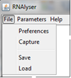
Upper menu is divided into three parts: File, Parameters and Help.
-
In "File" option, user can:
-
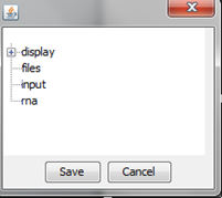
Set parameters of the visualization – it can be done any time during analysis ("Preferences"):
-
"display" option
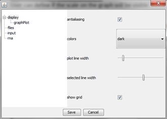
It gives an access to set basic parameters of the graph such as antialiasing, color of the background, width of the selected and unselected line, and grid visibility.
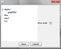
With option "graphPlot" user can define visibility of the scale on the graph.
-
"files" option
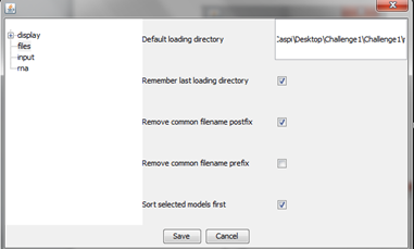
User can set basic parameters regarding default working directory, tracing what is the last directory used for storing structures, postfix and prefix of the files, and sorting selection of models as a first on the list in list of models area.
-
"input" option
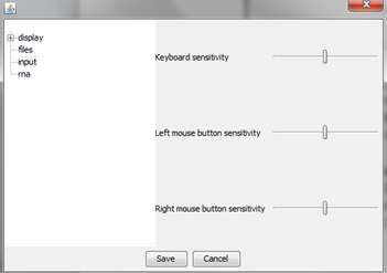
User can choose how sensitive will be its mouse and keyboard during interaction with plots.
-
"rna" option
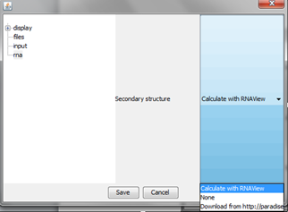
User can choose the ability to show secondary structure of RNA (structure is presented on the graph, below nucleotide letter) using RNAView or Paradise software – internet connection is needed for this feature.
-
-
Capture current graph and save it in gnu format with the definition of width, height and transparency of the picture ("Capture").
-
Save current stage of analysis (including structures, parameters, etc.) ("Save").
-
Load saved analysis ("Load").
-
-
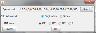
In Parameters option user can set parameters used during stage of computation such as:
- • set of sphere radii,
- • calculation mode,
- • type of atom.
-
Sphere radii

User can define which radii of the sphere wants to analyze. For each radius sphere will be generated and visualized. To set own set user should choose “select” button, and define values of the radii. After that button “Add” should be used to confirm selection.
-
Calculation mode
- • Single atom – only type of atoms selected in 3. will be included in the sphere during sphere building process.
- • Sphere – all atoms from the RNA structure will be included in the sphere during sphere building process.
-
RNA mode
User can choose one of the following atoms: C1', O5', O3' or P which will be used as a center of the sphere.
-
In "Help" option – short information regarding RNAlyzer.
Operational menu
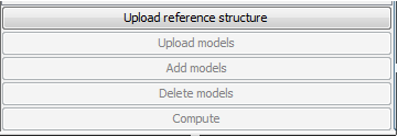
"Operational menu" is used for uploading and deleting models, as well as launching computational stage.
- • Upload reference structure – one can upload structure that will be used as reference during validation – only one structure can be uploaded at a time.
- • Upload models – one can upload several models that will be compared to reference structure.
- • Add models – additional models can be used during analysis – If you add new models, computational stage should be launched again.
- • Delete models – chosen models can be removed from analysis.
- • Compute – Computational models is launched, and program will proceed to the visualization immediately after the computation.
Graph menu
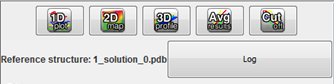
After the computational stage, user can see what is the name of reference structure, and check if any problems appeared during computations ("Log" button). At the top of the menu, 5 buttons are presented – one button corresponds to one type of graph – from left to the right:
- • Multi-model plot.
- • 2D map plot.
- • 3D plot.
- • RMSD averaged plot.
- • Cutoff plot.
Models menu

Models menu consist of list of models as well as gives ability to work in interactive way with particular type of plot.
Depending of the type of graph, menu included the RMSD value that correspond to particular model (Multi-model plot, RMSD averaged plot) (a), or the column "selection" (2D map plot, 3D plot) (b). For cutoff plot column RMSD is replaced by the column "% under cutoff" (a).
Additionally, in cutoff plot there are three ways of calculation score. By defaults, RNAlyzer is extracting common set of atoms from reference structure and model. If some atoms are missing RMSD is calculated only between existing atoms that were matched. Such methodology is valid for 4 types of plots (Multi-model, 2D map, 3D, and RMSD average). Additionally, for cutoff plots, the user can choose the way the missing atoms are treated:
- Default (as described above),
- In each sphere the proportion between missing and all the atoms is calculated, and if the result is below 1, a corresponding proportion is added to the final result ("exclude incomplete regions"),
- If atoms that should exist in the sphere are missing, the sphere is not calculated and it works against the final result ("exclude not predicted regions").
In the middle of menu user can see list of models that are analyzed. On the left side (a) one can find slider that can be used to navigate through the analyzed sequence be choosing nucleotide number. On the right side one can find slider that is responsible for sphere radius.
On the 2D map and 3D plots only one model can be visualized in one time. The model can be chosen by proper selection in the column "Selection".
At the top of the menu one can set manually nucleotide number and sphere radius value (a). Filter field situated above list of models can be used to find particular model by the name.
If user click the bar with the name of the column, models are sorted.
Column "Visible" can be used to choose which models should be visualized in the visualization area. The color that corresponds to the model can changed by clicking on the particular color in the column "Color".
The bar on the far left of the Models menu marked with ">" can be used to hide menu leaving whole area for visualization.
Navigation with models selection is hidden under right mouse click menu.
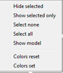
With this menu user can select and unselect models as well as set color of the line.
The option "Show model" gives the ability to show the whole structure of the molecule with Jmol applet.

Multi-model plot
An example of Multi-model plot is presented in Figure 1. This is a multiple model line plot, where each line describes a single model analyzed. Each model is shown in a different color. RMSD values between atoms from the reference structure and corresponding atoms from the model analyzed are calculated for atoms included in the sphere, where the center of the sphere is a selected atom (predefined by the user). Spheres are built for every nucleotide in the considered reference structure.
The Multi-model plot visualizes how accurate is the prediction of atoms located in the neighborhood of every nucleotide, taking into consideration the sphere radius (each line describes exactly one structural model - different colors correspond to different models). With a low radius (small local neighborhood – high precision of assessment), the local quality of models analyzed is very good for almost all nucleotide residues in the model, because accurate modeling of chemical structures of nucleotide residues is relatively easy. With the increasing value of radius one can easily identify the parts of models that exhibit different accuracies of prediction, from low values of RMSD that indicate correct predictions, to important structural errors (for example different torsion angles – high values of RMSD for local neighborhood) that should be widely and carefully analyzed. If the radius increases to match the molecule radius (i.e. at the very low level of precision of assessment), RMSD value for the sphere that contains all nucleotides levels off to the same value, equal to global RMSD for a particular model (Fig. 1E).
The main feature of the Multi-model plot is Y-axis scaling of all predicted models to the potentially worst model, because its RMSD values are the highest. Visualization of two prediction models that differ significantly (one model – very good quality of prediction, second model – significant structural errors) on the Multi-model plot can be confusing because the RMSD value for the worse model may dominate the visualization of errors for the model with a better accuracy. Hence, the user can analyze each model separately.

Figure 1. Multi-model plot for Challenge_3 of RNApuzzless contest; each plot (A-E) represents results for a different sphere radius (3, 8, 20, 38, and 300 Å). X-axis represents the order of nucleotides in the sequence, Y- axis represents the value of RMSD.
RMSD averaged plot
An example of RMSD averaged plot is shown in Figure 2. This is also a multiple model line plot, where each line describes exactly one structural model (different colors correspond to different models). The difference between Multi-model plot and RMSD averaged plot is that in the latter case the Y-axis represents values of RMSD calculated as the averaged sum of RMSD of spheres built with fixed radius for all nucleotides of the analyzed RNA molecule. This plot visualizes how averaged RMSD values change with an increasing sphere radius. In general, this plot describes the changes of quality of prediction from the local structural neighborhood to the whole molecule point of view.

Figure 2. RMSD averaged plot; X-axis represents the sphere radius, Y-axis represents averaged RMSD for all spheres with fixed radius (different colors correspond to different models).
2D map plot
An example of a 2D map plot is presented in Figure 3. This plot visualizes exactly one model at a time. The values of RMSD are represented with a colored scale - RMSD values correspond to colors from blue (high prediction quality) to red (low prediction quality). The X-axis represents residue numbers (in sequential order), and the Y-axis represents the radius values from the spheres radii vector defined by the user. This plot shows where the prediction is inaccurate and allows the user to check if prediction errors are similar for different structures.
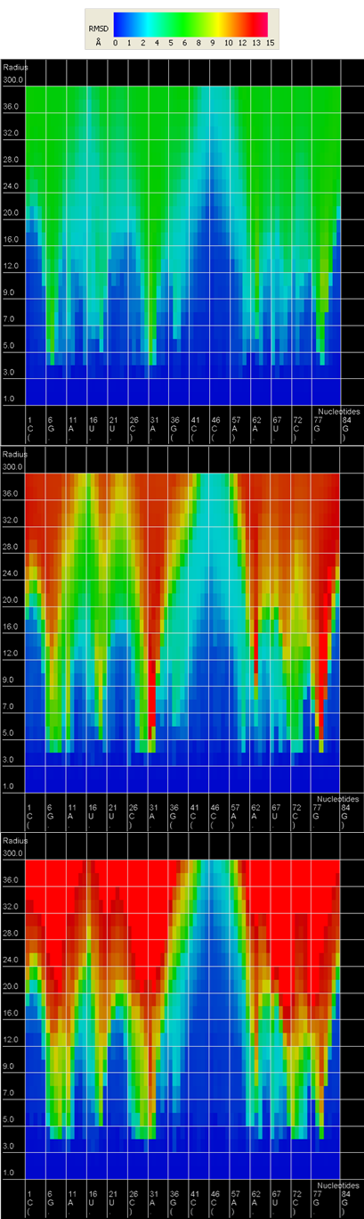
Figure 3. 2D map plot - each map corresponds to one of the analyzed models; X-axis represents the order of nucleotides in the sequence, Y-axis represents the sphere radius, color of the cell represents the RMSD value, following the scale presented at the bottom (blue – low RMSD, red – high RMSD).
3D plot
An example of a 3D plot is presented in Figure 4. The X-axis represents nucleotide numbers in sequential order, the Z-axis represents the radius values from the spheres radii vector defined by the user, and the Y-axis represents RMSD. The value of RMSD is also represented with the colored scale. Both plots (2D map plot and 3D plot) describe the accuracy of fragments of a prediction model around certain nucleotides.
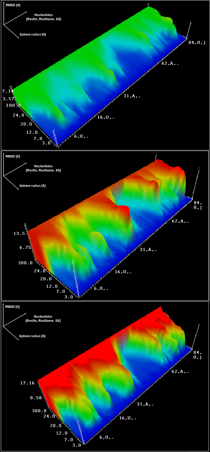
Figure 4. 3D plot – analysis of three models; X-axis represents the order of nucleotides, Y-axis represents sphere radius, Z-axis represents RMSD.
Cutoff plot
An example of a Cutoff plot is presented in Figure 5. Cutoff plot shows how accurate is the prediction of a particular model from a local point of view or, in other words, which part of the model structure is predicted correctly. The calculation is performed based on the fixed precision value (cutoff) for each sphere radius value, defined by the user in spheres radii vector. As a result, the user receives information about the atoms set predicted below cutoff (%). The value of cutoff can be changed interactively by the user.
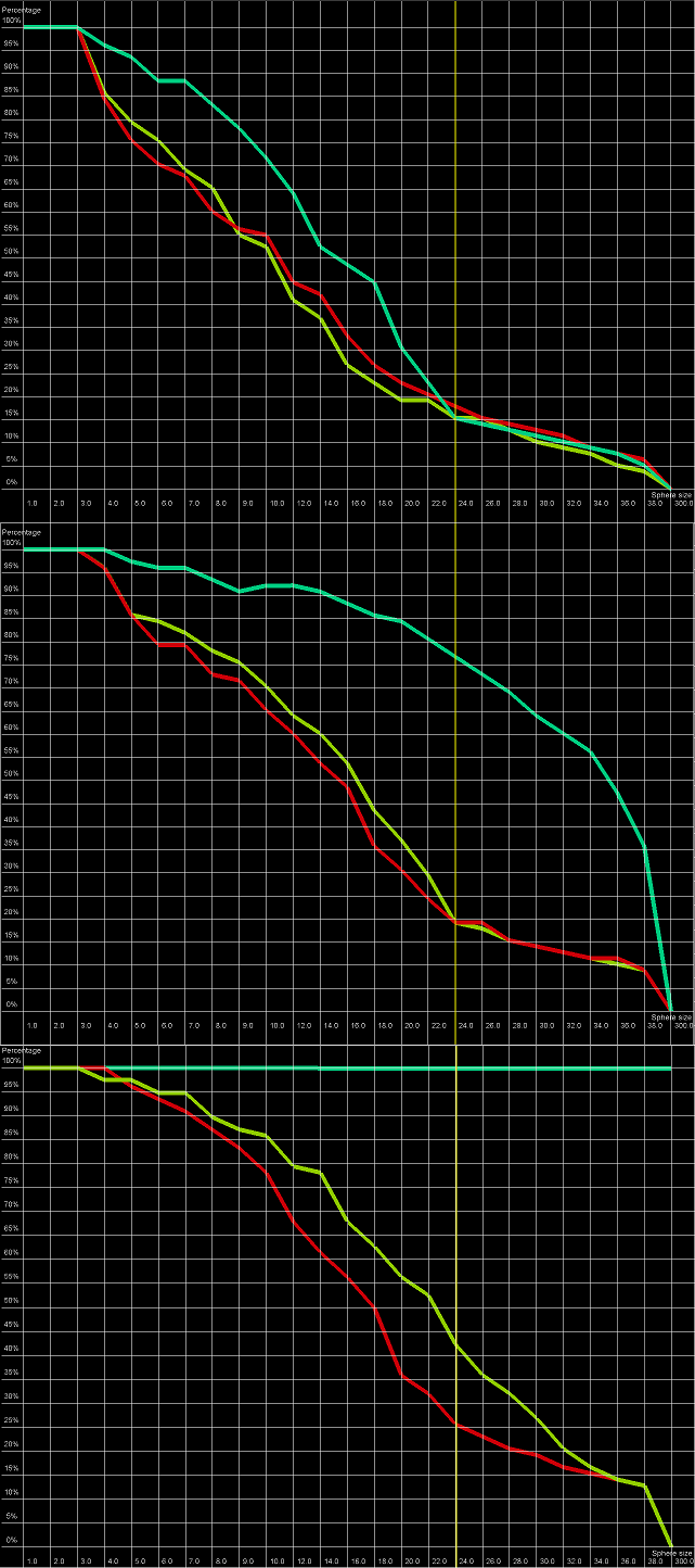
Figure 5. Cutoff plot presents a percentage of the number of atoms sets included in spheres with fixed radius for each considered model, which are below a selected precision value. One line corresponds to one model. X-axis corresponds to sphere value, Y axis corresponds to percentage value. On the picture above one can see plots for precision values (from top to the bottom: 4 Å, 7 Å and 10 Å) for radius of the sphere equal to 24 Å (different colors correspond to different models).